In the companion post, I briefly covered the theory behind linear models. In this post, I will go through an example while revisiting some of the principles we described there. This small example should demonstrate the ease with which linear models can be extended to accommodate data with varying structures and satisfy a range of distributional assumptions. An example will also give us the opportunity to highlight some best practices. We will be looking at (made-up) data from neuronal recordings, created and analyzed in R.
Table of Contents
Construct and inspect the data
Expand code
packageList = c("ggplot2", # Plotting
                "sjPlot", # Tables for model outputs
                "cowplot", # Arrange plots
                "ggbeeswarm", # Beeswarm plots
                "DHARMa", # Residual simulation
                "reshape2", # "Melt" matrices
                "lme4") # Fit mixed models
ph = lapply(packageList,
            require,
            character.only = TRUE)
In the next code block I will create the data:
seed = 0
set.seed(seed) # For reproducible results
n = 600 # Total sample size
nID = 20 # Number of neurons
nTrials = n/nID
# "Ground truth" coefficients
b0 = 1.6 # Intercept
bStim = 0.7
bArea = -1.6
bAreaXStim = 0.7 # Interaction area X stim
# Design matrix
stimKernel = c("no-stim", "stim")
stim = factor(c(rep(stimKernel[1], n/2),
                rep(stimKernel[2], n/2)),
              levels = stimKernel)
areaKernel = c("thalamus", "cortex")
area = factor(rep(areaKernel, n/2),
              levels = areaKernel)
temp = round(rnorm(n, 25, 1), 1) # Degrees Celsius
trial = 1:n
id = rep(1:nID, nTrials)
u = 0.3
zeta = rep(rnorm(nID, 0, u), nTrials)
# Simulate response
xArea = contrasts(area)[area]
xStim = contrasts(stim)[stim]
mu = exp(b0 + bStim*xStim + bArea*xArea + bAreaXStim*xArea*xStim + zeta)
nSpikes = rpois(n, mu)
# Bind data
data = data.frame(trial, id, stim, area, temp, nSpikes)
Let’s first have a look at a sample of the data for a single neuron:
Expand code
data1 = data[data$id == 1, ]
sampleArray = rbind(head(data1), NA, tail(data1))
ShowTable = function(sampleArray) {
  kable(sampleArray,
        align = "l",
        format = "markdown",
        row.names = FALSE,
        digits = 4)
}
ShowTable(sampleArray)
| trial | id | stim | area | temp | nSpikes |
|---|---|---|---|---|---|
| 1 | 1 | no-stim | thalamus | 26.3 | 4 |
| 21 | 1 | no-stim | thalamus | 24.8 | 1 |
| 41 | 1 | no-stim | thalamus | 26.8 | 6 |
| 61 | 1 | no-stim | thalamus | 25.4 | 0 |
| 81 | 1 | no-stim | thalamus | 24.2 | 3 |
| 101 | 1 | no-stim | thalamus | 25.8 | 2 |
| … | … | … | … | … | … |
| 481 | 1 | stim | thalamus | 22.7 | 6 |
| 501 | 1 | stim | thalamus | 24.4 | 5 |
| 521 | 1 | stim | thalamus | 24.0 | 7 |
| 541 | 1 | stim | thalamus | 24.7 | 5 |
| 561 | 1 | stim | thalamus | 25.8 | 10 |
| 581 | 1 | stim | thalamus | 24.7 | 4 |
There are 20 neurons in this dataset.
For each neuron located in either of two brain areas
–the thalamus and the cortex–
the number of spikes recorded per trial is stored in the variable nSpikes.
In half of the trials, each neuron received stimulation
(total number of trials per neuron is 30).
The temperature during the trial was recorded
in degrees Celsius in the variable temp.
First, I will plot the number of spikes per trial for all neurons split into groups based on whether they received stimulation or not.
Expand code
my_theme =
  theme_classic() +
  theme(text = element_text(face = "bold",
                            size = 14,
                            family = "Noto"),
        panel.grid.major = element_line())

PlotBeeswarm = function(data, my_theme, ...) {
  p1 = ggplot(data = data, aes(stim, nSpikes, ...)) +
    geom_beeswarm(alpha = 0.3, cex = 0.5, size = 1.5) +
    labs(x = "Stimulation",
         y = "Spikes per trial") +
    my_theme
  return(p1)
}
p1 = PlotBeeswarm(data, my_theme)
p1
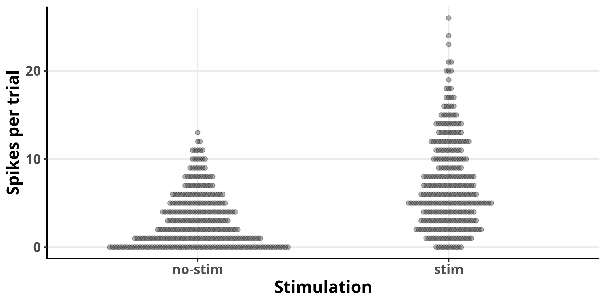
Each dot represents an observation. It is clear from the plot that stimulation increases the average number of spikes per trial and the variance of their distribution.
Linear model
Let’s fit a linear model to investigate:
lm1 = lm(nSpikes ~ 1 + stim, data)
I have specified a formula nSpikes ~ 1 + stim for this model.
This form of formula specification is called
Wilkinson notation.
The above model is equivalent to the following equation:
$$ nSpikes = \beta_0 + \beta_{stim}x_{stim} \label{eq:lin_mod} $$
where $\beta_0$ is the estimate for the intercept,
which corresponds to the term 1 in Wilkinson notation,
and $\beta_{stim}$ is the estimate for the effect of factor $x_{stim}$,
which can either take values of $0$ or $1$,
for the absence or presence of stimulation, respectively.
The model’s output is shown in the following table:
Expand code
ConstructModelTable = function(mdl, ...) {
  tab_model(mdl,
            pred.labels = c("Intercept", attr(terms(mdl), "term.labels")),
            p.style = "numeric",
            collapse.ci = TRUE,
            linebreak = FALSE,
            show.aic = TRUE,
            emph.p = FALSE,
            transform = NULL,
            ...)
}
ConstructModelTable(lm1, show.fstat = TRUE)
| n Spikes | ||
|---|---|---|
| Predictors | Estimates | p |
| Intercept | 3.16 (2.68 – 3.64) | <0.001 |
| stim | 4.10 (3.42 – 4.77) | <0.001 |
| Observations | 600 | |
| R2 / adjusted R2 | 0.191 / 0.190 | |
| AIC | 3433.405 | |
The model is picking up what we can readily observe from the plot.
The intercept estimate corresponds to the number of spikes per trial
in cases where the neurons received no stimulation,
and its value is detected to differ from $0$.
The reason that the intercept estimate corresponds to
the case where no stimulation was applied
is that the first level of the categorical variable stim
is set to $0$ by default.
We can see from equation $\eqref{eq:lin_mod}$
that when we set $\beta_{stim}$ to $0$
the estimate for the response variable is equal to
the intercept term, $\beta_0$.
The estimate labelled stim corresponds to the number of spikes per trial
in the presence of stimulation, in excess of those for the intercept estimate.
ANOVA interlude: The results of an ANOVA on the same data are identical to those of the simple linear model presented above:
aov1 = aov(nSpikes ~ stim, data)
Expand code
kable(anova(aov1),
        align = "l",
        format = "markdown",
        digits = 3)
| Df | Sum Sq | Mean Sq | F value | Pr(>F) | |
|---|---|---|---|---|---|
| stim | 1 | 2517.402 | 2517.402 | 141.625 | 0 |
| Residuals | 598 | 10629.557 | 17.775 |
To see that, compare the F-statistic value between the two outputs.
Expand code
modelFStat = data.frame(model = c("Linear model",
                                  "ANOVA"),
                        Fstat = c(summary(lm1)$fstatistic[1],
                                  summary(aov1)[[1]]$`F value`[1]))
kable(modelFStat,
      col.names = c("Model",
                    "F-statistic"),
      row.names = FALSE,
      align = "l",
      format = "markdown",
      digits = 3)
| Model | F-statistic |
|---|---|
| Linear model | 141.625 |
| ANOVA | 141.625 |
In fact, the R function I used for the ANOVA (aov)
is simply using the function I used to fit the linear model (lm)
under the hood.
The help page for aov includes the following note:
aovis designed for balanced designs, and the results can be hard to interpret without balance: beware that missing values in the response(s) will likely lose the balance. If there are two or more error strata, the methods used are statistically inefficient without balance, and it may be better to use [liner mixed models]
Thus, I suggest that it is preferable to explicitly use linear models to become familiar with a statistical procedure that is easily extendable to accommodate more complicated data structures while achieving the same results as ANOVA.
Going back to the original linear model, the next step should always be to evaluate the fit:
Expand code
blank_style = my_theme +
  theme(axis.line.y = element_blank(),
        axis.text.y = element_blank(),
        axis.ticks.y = element_blank(),
        axis.title.y = element_blank())

lmPredict = predict(lm1, interval = "confidence", level = 0.95)

OverlayPrediction = function(gPlot, data, predictionTable,
                             fillValue, fill, colour,
                             showLegend = FALSE, ...) {
  gp = gPlot +
    geom_ribbon(aes(x = as.numeric(data$stim),
                    ymin = predictionTable[,2],
                    ymax = predictionTable[,3],
                    fill = fill,
                    colour = NULL),
                alpha = 0.2) +
    geom_line(aes(x = as.numeric(data$stim),
                  y = predictionTable[,1],
                  ...),
              size = 1) +
    geom_point(aes(x = as.numeric(data$stim),
                   y = predictionTable[,1],
                   fill = fill,
                   ...),
               shape = 22,
               size = 4,
               stroke = 1.5,
               colour = "black") +
    scale_colour_manual(values = fillValue,
                        name = NULL) +
    scale_fill_manual(values = fillValue,
                        name = NULL) +
    guides(colour = FALSE) +
    theme(legend.position = c(0.25, 0.9))

  if (showLegend != TRUE) {
    gp = gp + theme(legend.position = "none")
  }

  return(gp)

}

PlotQQ = function(mdl, my_theme) {

  gp = ggplot(mdl, aes(sample = .resid)) +
    stat_qq_line(size = 1,
                 linetype = "dashed",
                 alpha = 0.5) +
    stat_qq(alpha = 0.3) +
    labs(x = "Theoretical",
         y = "Sample") +
    my_theme

  gp = gp +
    coord_cartesian(ylim = range(pretty(residuals(mdl))))
}

PlotResidualHistogram = function(mdlResiduals, my_theme) {

  nBins = 20
  binLabels = c(0, 50, 100, 150, 200)

  xLim = range(pretty(mdlResiduals))

  gp = ggplot() +
    geom_histogram(aes(mdlResiduals),
                   bins = nBins) +
    labs(y = "Count") +
    coord_flip(xlim = xLim) +
    my_theme

  binCounts = c(ggplot_build(gp)$data[[1]]$count, 50)
  yLim = binLabels[binLabels <= max(binCounts)]

  gp = gp +
    scale_y_continuous(breaks = yLim,
                       labels = yLim) +
    expand_limits(y = max(c(max(binCounts), max(yLim))))

}

ArrangePlots = function(pA, pB, pC) {
  plot_grid(pA, pB, pC,
            labels = c("a", "b"),
            ncol = 3,
            rel_widths = c(2, 1.5, 0.75))
}

p2a = OverlayPrediction(p1, data, lmPredict,
                        fillValue = "black",
                        fill = "black",
                        colour = rgb(2/3, 2/3, 2/3))
p2b = PlotQQ(lm1, my_theme)
p2c = PlotResidualHistogram(lm1$residuals, blank_style)
ArrangePlots(p2a, p2b, p2c)
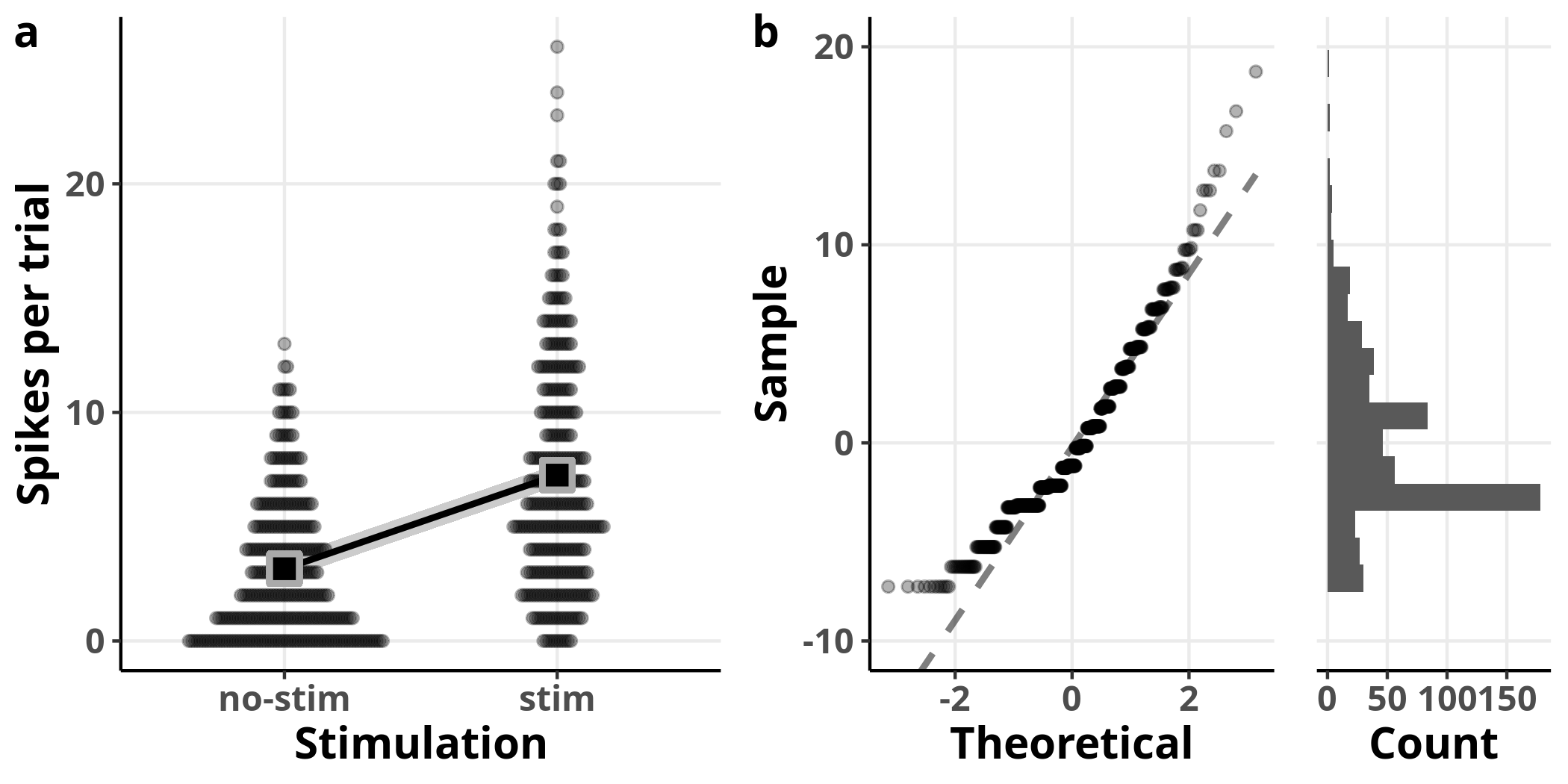
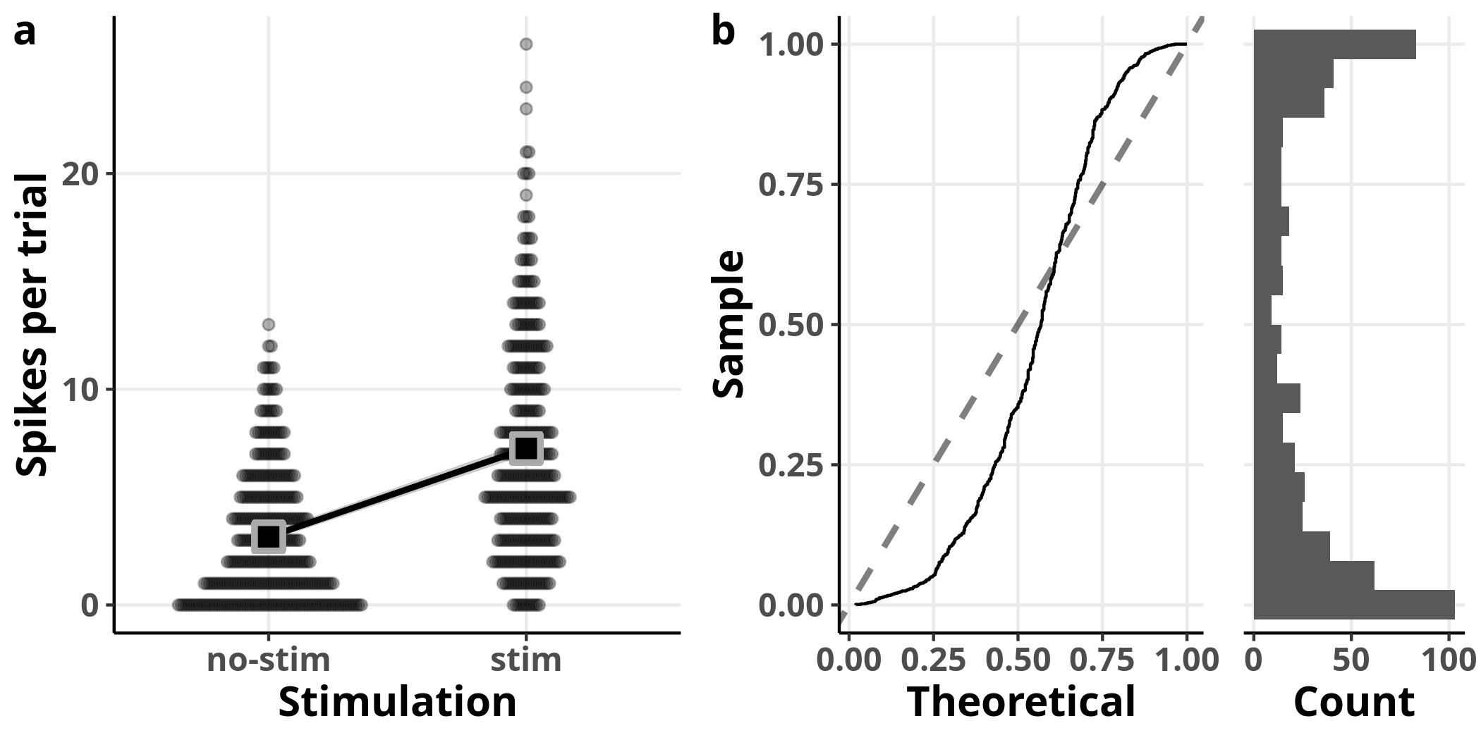
In panel a I added the model’s estimated slope with 95% confidence intervals on top of the data. The square symbols designate the estimated average number of spikes per trial. The left plot in panel b is showing us the theoretical versus the observed quantiles of the fit’s residuals. The residuals represent how much off the fit was for every single observation, i.e. the distance of each point in panel a from the fit line. Recall that the residuals represent the error estimate and are assumed to be approximately normally distributed with an average of $0$. If that was the case, we should expect to see them distributed along the straight line shown on the plot. On the right of the same panel, we see the histogram of the residuals, as another way to visually assess their distribution.
From these plots, we see clearly that the model fails to accommodate the structure of the data. We can also see the inadequacy of the model in the estimates of the linear model: whereas the coefficient estimate accurately describes the relationship between the two groups, the reported standard errors are inaccurate (e.g. 0.24 from the model versus 0.18 from the data for the intercept).
There are certain things we should consider at this point to improve our model. Some may attempt to discard some observations as outliers. However, this is almost never a good idea unless there are good reasons to think that the data acquisition was somehow compromised. Even if that was the case, these are considerations that should be addressed before running any analyses to avoid any potential bias.
Linear model with log-transformed response variable
Another approach would be to apply some transformation to the data to satisfy the assumptions of our model. One option we could consider for these data is to log-transform the response variable.
Expand code
logData = data
logData$nSpikes = log10(data$nSpikes)
logData1 = logData[logData$id == 1, ]
sampleArray = rbind(head(logData1), NA, tail(logData1))
ShowTable(sampleArray)
| trial | id | stim | area | temp | nSpikes |
|---|---|---|---|---|---|
| 1 | 1 | no-stim | thalamus | 26.3 | 0.6021 |
| 21 | 1 | no-stim | thalamus | 24.8 | 0.0000 |
| 41 | 1 | no-stim | thalamus | 26.8 | 0.7782 |
| 61 | 1 | no-stim | thalamus | 25.4 | -Inf |
| 81 | 1 | no-stim | thalamus | 24.2 | 0.4771 |
| 101 | 1 | no-stim | thalamus | 25.8 | 0.3010 |
| … | … | … | … | … | … |
| 481 | 1 | stim | thalamus | 22.7 | 0.7782 |
| 501 | 1 | stim | thalamus | 24.4 | 0.6990 |
| 521 | 1 | stim | thalamus | 24.0 | 0.8451 |
| 541 | 1 | stim | thalamus | 24.7 | 0.6990 |
| 561 | 1 | stim | thalamus | 25.8 | 1.0000 |
| 581 | 1 | stim | thalamus | 24.7 | 0.6021 |
Unfortunately, this approach is problematic not in the least because there were observations with no spikes in some trials and the log of $0$ is not defined. We could still go on and fit a model for the sake of the example, treating those undefined values as missing.
logData = logData[logData$nSpikes != -Inf,]
lm2 = lm(nSpikes ~ 1 + stim, logData)
Expand code
ConstructModelTable(lm2)
| n Spikes | ||
|---|---|---|
| Predictors | Estimates | p |
| Intercept | 0.50 (0.46 – 0.55) | <0.001 |
| stim | 0.26 (0.20 – 0.32) | <0.001 |
| Observations | 517 | |
| R2 / adjusted R2 | 0.130 / 0.128 | |
| AIC | 349.632 | |
Expand code
lmPredict = predict(lm2, interval = "confidence", level = 0.95)
p3a = OverlayPrediction(PlotBeeswarm(logData, my_theme),
                        logData,
                        lmPredict,
                        fillValue = "black",
                        fill = "black",
                        colour = rgb(2/3, 2/3, 2/3))
p3b = PlotQQ(lm2, my_theme)
p3c = PlotResidualHistogram(lm2$residuals, blank_style)
ArrangePlots(p3a, p3b, p3c)
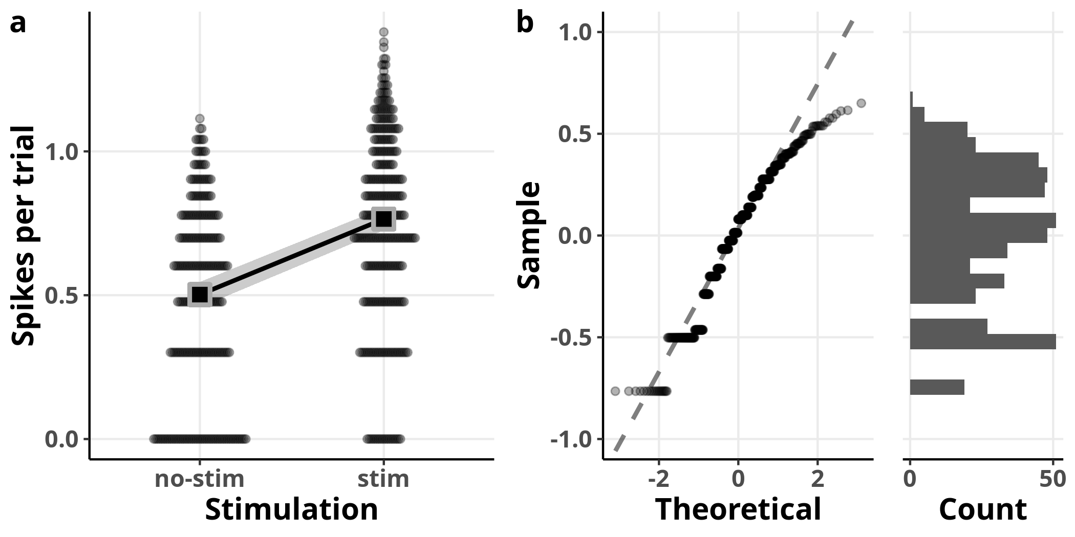
This model is also able to detect increased spiking with stimulation. Although the diagnostic plots look much better, the coefficient estimates are underestimating the true effect (e.g. 1.65 from the model versus 3.16 from the data for the intercept on the original scale). The reason for that is Jensen’s inequality, which states that the expected value (i.e. the mean) of a concave function, such as the logarithm, is bound to be smaller than or equal to the transformed expected value: $$ \mathbb{E}[f(X)] \le f(\mathbb{E}[X]) \label{eq:jensen_inequality} $$ It is not trivial to get unbiased estimates in units of the original scale, especially for interval estimates such as confidence intervals.1
Poisson regression
A better approach is to use a GLM that natively incorporates the structure of the data at hand. Since our response variable consists of counts of a process, the number of spikes per trial, the Poisson distribution is a natural fit (pun intended).
glm1 = glm(nSpikes ~ 1 + stim, family = poisson, data)
Expand code
ConstructModelTable(glm1, show.r2 = FALSE)
| n Spikes | ||
|---|---|---|
| Predictors | Log-Mean | p |
| Intercept | 1.15 (1.09 – 1.21) | <0.001 |
| stim | 0.83 (0.76 – 0.91) | <0.001 |
| Observations | 600 | |
| AIC | 3812.542 | |
Our estimates are reasonably close to the real values of 1.6 for the intercept and 0.7 for stimulation.
The evaluation of Q-Q plots for GLMs is not as straightforward as for those we used for our linear regression models since we do not assume that the residuals are normally distributed and it is harder to diagnose deviations from the Poisson distribution visually. For this reason, we will use simulation.
Expand code
nSim = 1000
sim1 = simulateResiduals(glm1, seed = seed, n = nSim)

glmPredict = predict(glm1, se.fit = TRUE)
ci95 = glmPredict$fit + outer(glmPredict$se.fit, qnorm(c(0.025, 0.975)))
glmPredict$low = exp(ci95[, 1])
glmPredict$upp = exp(ci95[, 2])
glmPredict$response = exp(glmPredict$fit)
glmPredTable = with(glmPredict, cbind(response, low, upp))

p4a = OverlayPrediction(p1,
                        data,
                        glmPredTable,
                        fillValue = "black",
                        fill = "black",
                        colour = rgb(2/3, 2/3, 2/3))

PlotQQGLM = function(sim, my_theme) {
  gp = ggplot() +
    stat_ecdf(aes(sim$scaledResiduals), pad = FALSE) +
    geom_abline(slope = 1, size = 1, linetype = "dashed", alpha = 0.5) +
    coord_flip(xlim = c(0, 1)) +
    labs(x = "Sample",
         y = "Theoretical") +
    my_theme +
    theme(panel.grid.minor.x = element_blank())
}

p4b = PlotQQGLM(sim1, my_theme)
p4c = PlotResidualHistogram(sim1$scaledResiduals, blank_style)
ArrangePlots(p4a, p4b, p4c)
In panel a, I plot once more the data overlaid with the output of the GLM. In panel b, I plot the resulting residuals from a simulation which involved replicating the dataset 1000 times. A value of $0$ for the simulated residuals means that all simulated values were greater than the corresponding observed value. If the model fit was perfect, we should get uniformly distributed simulated residuals: they would appear close to the diagonal dashed line with slope $1$ in the left plot of panel b and their histogram on the right would be flat. In this case, we can observe detectable deviations from a uniform distribution.
Including more variables in the model
So far we have kept our models simple to explain some basic ideas. Let’s now add more of the available variables as parameters in our model.
glm2 = glm(nSpikes ~ 1 + stim*area*temp, family = poisson, data)
The asterisks in the formula above designate that
we are requesting that the model includes
stim, area, and temp as well as all possible interactions between them.
We can express the same model with the expanded Wilkinson notation:
nSpikes ~ 1 + stim + area + temp +
          stim:area + stim:temp + area:temp +
          stim:area:temp
where the symbol : indicates an interaction term.
The corresponding formula for this model is:
$$ \begin{align} nSpikes = {\beta_0 + \\ \beta_{stim}x_{stim} + \\ \beta_{area}x_{area} + \\ \beta_{temp}x_{temp} + \\ \beta_{(stim,area)}x_{(stim,area)} + \\ \beta_{(stim,temp)}x_{(stim,temp)} + \\ \beta_{(area,temp)}x_{(area,temp)} + \\ \beta_{(stim,area,temp)}x_{(stim,area,temp)}} \end{align} \label{eq:glm_interaction} $$
Expand code
ConstructModelTable(glm2, show.r2 = FALSE)
| n Spikes | ||
|---|---|---|
| Predictors | Log-Mean | p |
| Intercept | 2.38 (0.65 – 4.10) | 0.007 |
| stim | 0.23 (-1.90 – 2.36) | 0.833 |
| area | -3.50 (-8.41 – 1.40) | 0.161 |
| temp | -0.03 (-0.10 – 0.04) | 0.441 |
| stim:area | 4.59 (-0.85 – 10.03) | 0.098 |
| stim:temp | 0.02 (-0.07 – 0.10) | 0.683 |
| area:temp | 0.07 (-0.13 – 0.26) | 0.509 |
| stim:area:temp | -0.15 (-0.37 – 0.07) | 0.173 |
| Observations | 600 | |
| AIC | 2735.827 | |
Hm…Something has gone wrong here.
The estimates of this model are nowhere near their real values
and, except for the intercept, none other differs from $0$.
For example, the estimate for stim is 0.23
whereas its real value is 0.7.
Let’s plot the
variance-covariance matrix
of the estimates to investigate:
Expand code
maxVCOV = max(signif(range(vcov(glm2)),1))
scaleLimits = c(-maxVCOV, maxVCOV)

PlotVCOV = function(mdl, scaleLimits) {
  cvMat = vcov(mdl)
  cvMat[lower.tri(cvMat)] = NA
  cvMat = melt(cvMat, na.rm = TRUE)
  ggplot(data = cvMat, aes(x = Var1, y = Var2, fill = value)) +
    geom_raster() +
    geom_text(aes(label = round(value, 3)), color = "black") +
    scale_y_discrete(labels = c("intercept", attr(glm2$terms, "term.labels"))) +
    scale_x_discrete(labels = c("intercept", attr(glm2$terms, "term.labels"))) +
    my_theme +
    theme(axis.text.x = element_text(angle = 45, vjust = 1,
                                     size = 12, hjust = 1),
          panel.grid = element_blank()) +
    scale_fill_distiller(palette = "RdYlBu", limits = scaleLimits)
}

PlotVCOV(glm2, scaleLimits)
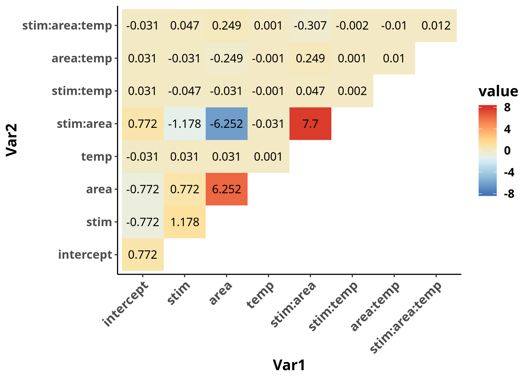
It appears that the variance-covariance matrix
takes values of different orders of magnitudes,
based on whether the corresponding estimates include the variable temp or not.
The reason is that the scale of the variable temp is in degrees Celsius,
which is on a completely different order of magnitude
compared to the rest of the variables (which are either $0$ or $1$),
and this fact is affecting the numerical stability of
the algorithm used for the estimates.
The way to solve the problems caused by this issue is to
scale
the variable temp.
glm3 = glm(nSpikes ~ 1 + stim*area*scale(temp), family = poisson, data)
PlotVCOV(glm3, scaleLimits)
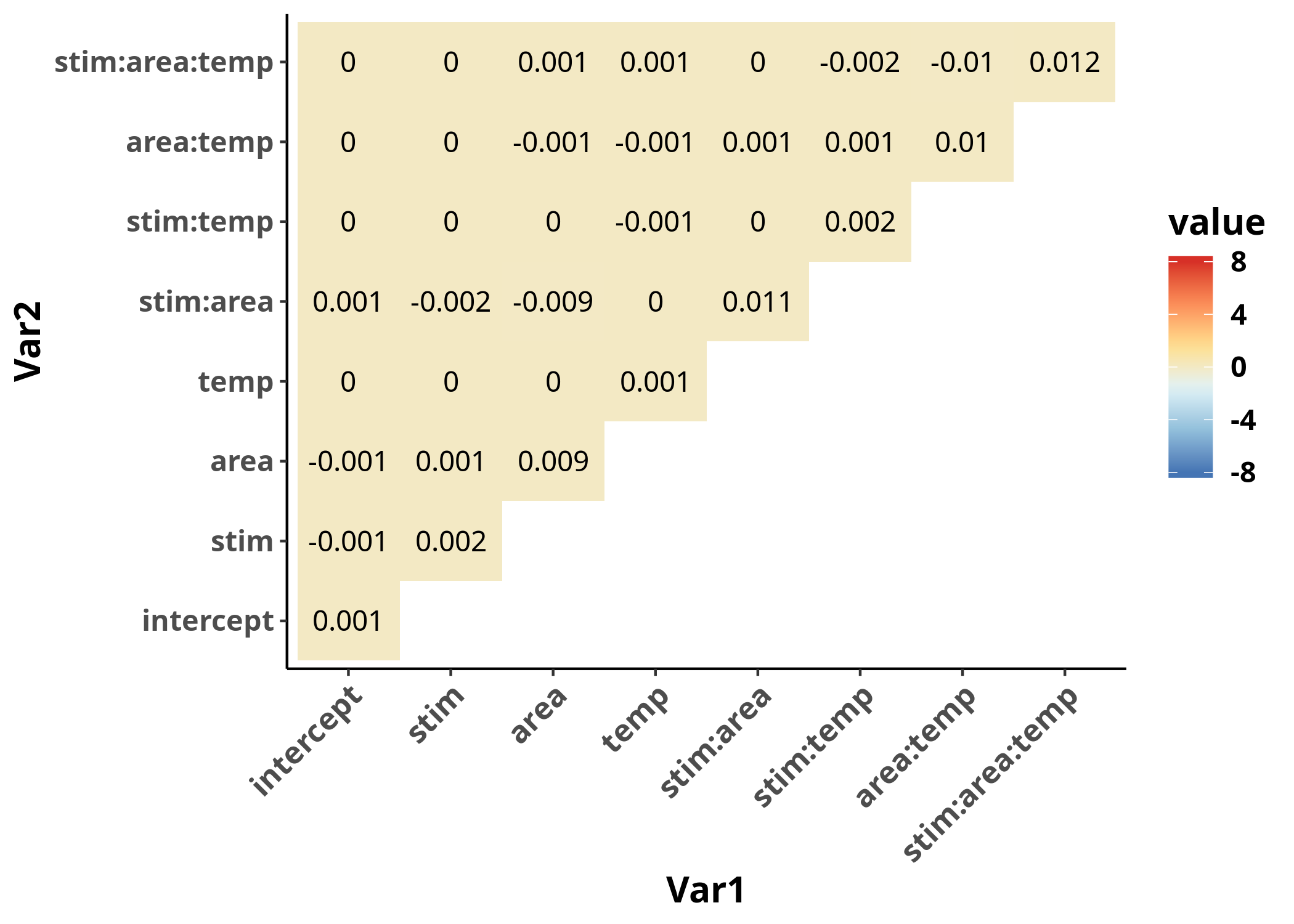
The variance-covariance matrix is now much more homogeneous, as we can observe when we plot both in the same range. More importantly, its values are closer to $0$, which is a requirement for the validity of our inferences from the model.
Another reason to scale,
or at least center a continuous variable such as temperature
by subtracting its mean,
is so that the interpretation of its coefficients is more meaningful.
If we had left temp on its original scale,
all coefficients except those for interaction terms that include temp
would refer to 0 degrees Celsius, which is not meaningful in this case.
By centering the continuous variable temp,
all estimates that do not include an interaction with it
refer to its average.
By scaling temp to its standard deviation,
we can interpret its coefficients as
the effect of one standard deviation change in temp
on the response variable.
It follows that it may not be required to center or scale a variable
when $0$ is a meaningful value
or when all variables are approximately on the same scale.
We can now have a look at the estimates of the model:
Expand code
ConstructModelTable(glm3, show.r2 = FALSE)
| n Spikes | ||
|---|---|---|
| Predictors | Log-Mean | p |
| Intercept | 1.70 (1.63 – 1.77) | <0.001 |
| stim | 0.67 (0.59 – 0.76) | <0.001 |
| area | -1.86 (-2.05 – -1.67) | <0.001 |
| scale(temp) | -0.03 (-0.09 – 0.04) | 0.441 |
| stim:area | 0.82 (0.61 – 1.03) | <0.001 |
| stim:scale(temp) | 0.02 (-0.07 – 0.10) | 0.683 |
| area:scale(temp) | 0.06 (-0.13 – 0.26) | 0.509 |
| stim:area:scale(temp) | -0.15 (-0.36 – 0.07) | 0.173 |
| Observations | 600 | |
| AIC | 2735.827 | |
The estimates of this model are much closer to the real values.
How can we interpret the returned coefficients?
The intercept estimate, 1.7,
corresponds to the case where all factors are set to $0$,
i.e. for observations in the thalamus
(since that is the first level of the factor area)
with no stimulation
(since that is the first level of the factor stim)
at the average temperature
(since we have centered and scaled the variable temp).
Since we are using a GLM with the Poisson distribution and the canonical link,
the logarithm function,
we need to transform the returned value back to the original scale:
$exp(1.7) = 5.47$ spikes per trial.
The coefficient for stim, 0.673,
corresponds to the case where all variables except stim are set to $0$,
i.e. for observations in the thalamus at average temperature with stimulation.
To obtain the estimated number of spikes for those observations,
we need to multiply the exponentiated estimates for the intercept and stim,
or, equivalently, add them and then exponentiate:
$ exp(1.7 + 0.673) = 10.7 $.
The coefficient for temp expresses
the influence of a unit change in scaled temperature (in standard deviations)
for observations in the thalamus under no stimulation
and is not detected to differ from $0$.
The interaction term stim:area corresponds to
the estimated number of spikes per trial with stimulation
for observations in the cortex,
in excess of those estimated for the intercept, stim, and area.
To calculate the estimated number of spikes for
observations in the cortex under stimulation
we need to sum all those coefficients for which stim and area are not $0$
but temp = 0,
i.e. $ exp(1.7 + 0.673 + (-1.86) + 0.818) = 3.78 $.
We can interpret the rest of the coefficients in a similar fashion.
The last entry of the table reports the Akaike Information Criterion (AIC) which is a measure of the information lost by the fitted model, penalized for the additional flexibility of the model due to the number of parameters included in the model and is defined as
$$ AIC = 2k -2 ln(\hat{L}) $$
where $k$ is the number of parameters in the model
and $\hat{L}$ is the maximum likelihood estimate.
The AIC is useful when we compare multiple models to find the model that
is better able to explain the data with the minimum number of parameters.
The model with the lowest AIC can be considered the most parsimonious model.
In this case, while we have increased the number of parameters
by including stim, area, temp and all their interactions,
the lower AIC value still justifies this more expanded model
over the reduced model we used before.
I should note that the AIC is only used as a rule of thumb
and it is not a statistical test.
In the context of statistical inference,
the inclusion of a parameter in a model should be primarily informed
by prior theoretical considerations rather than trying to minimize the AIC
or any other metric.
In the context of prediction,
various techniques
have been developed to deal with the problem of variable selection
that can be used without the risk of commiting
data dredging.
We can now evaluate the model.
I will first plot the effect of the variable temp on nSpikes
for different combinations of the other two variables, stim and area,
with independent Poisson regression fits overlaid for each combination,
to indicate whether there is any trend in the data.
Expand code
ggplot(data, aes(x = temp, y = nSpikes)) +
  geom_point(alpha = 0.2) +
  facet_grid(cols = vars(area), rows = vars(stim), as.table = FALSE) +
  geom_smooth(formula = y ~ x,
              method = glm,
              method.args = list(family = poisson),
              color = "black") +
  my_theme
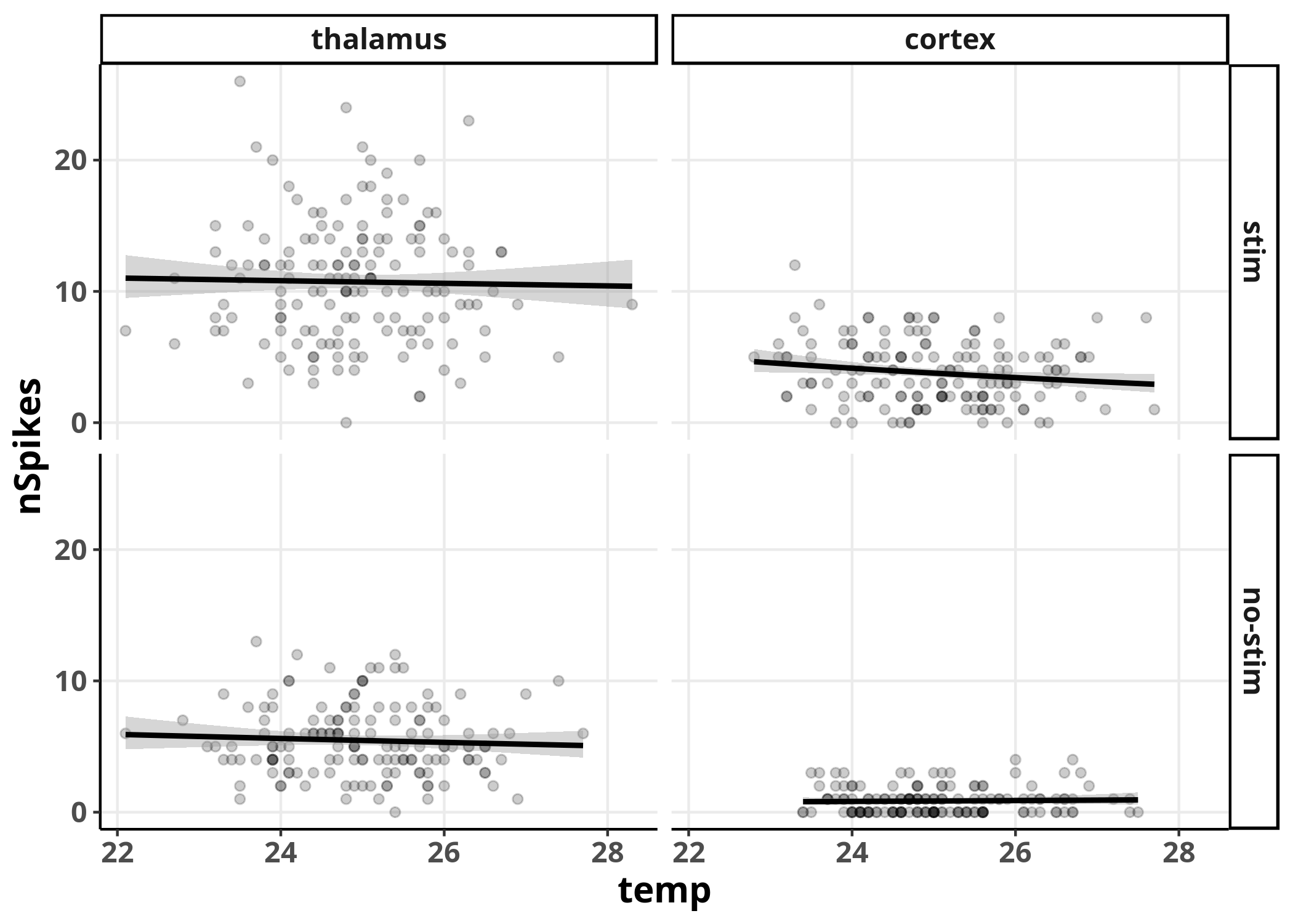 We can see no real trend in predicting
 nSpikes from temp
in none of the combinations with the other variables,
as we should expect since we did not include the variable temp
in the generation of the data.
Although we can already observe some effects for
the variables stim and area,
the comparisons are not visually straight-forward
between all the different combinations.
To make comparisons simpler,
let’s try a different plot where we ignore variations in temp,
by evaluating our Poisson regression model at the average temperature:
Expand code
sim2 = simulateResiduals(glm3, seed = seed, n = nSim)
newData = cbind(data[c("stim", "area")], temp = mean(data$temp))
glmPredict = predict(glm3, se.fit = TRUE, newdata = newData)
ci95 = glmPredict$fit + outer(glmPredict$se.fit, qnorm(c(0.025, 0.975)))
predTable = cbind(exp(glmPredict$fit),
exp(ci95[, 1]),
exp(ci95[, 2]))
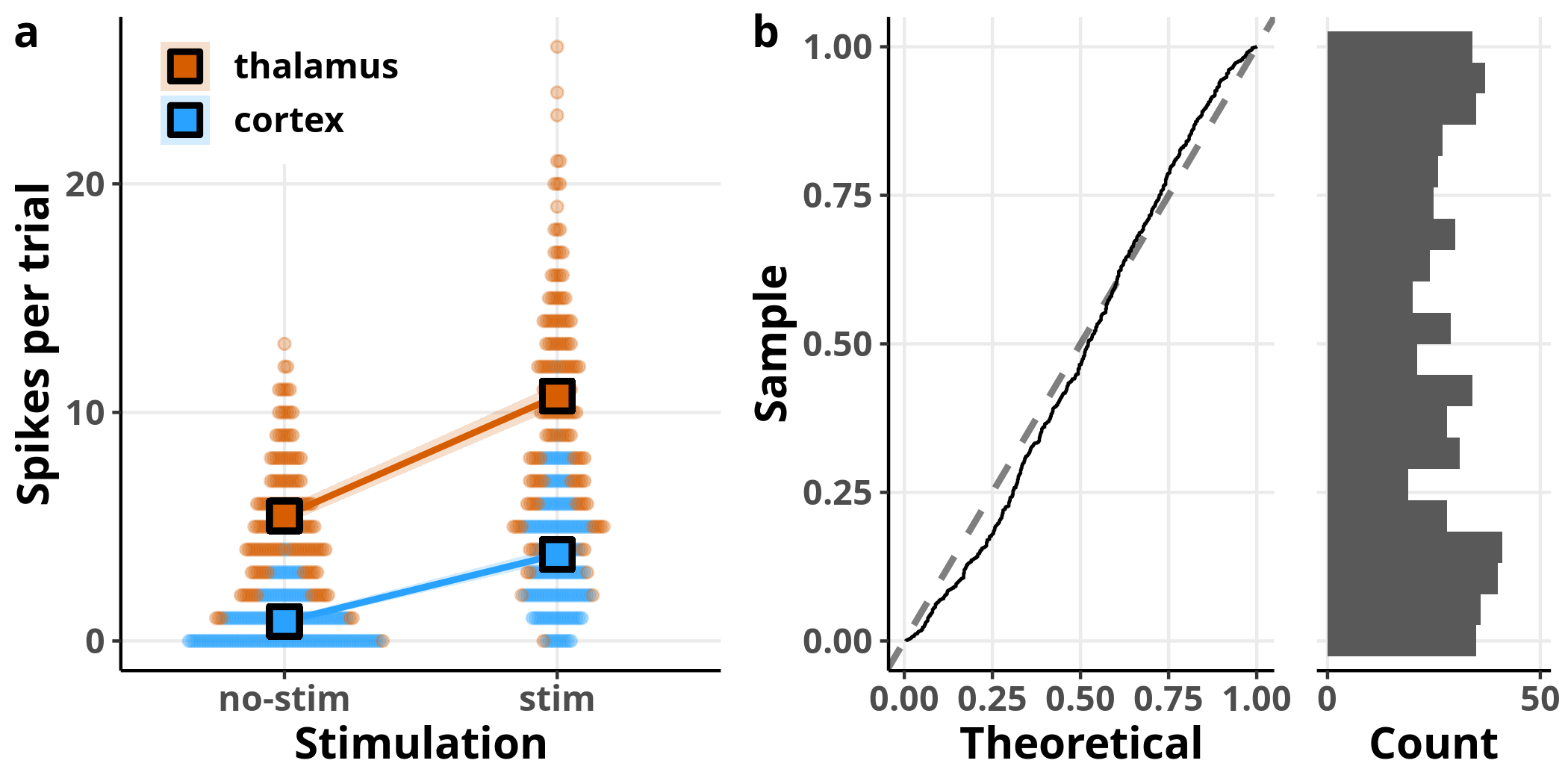
p5a_temp = PlotBeeswarm(data, my_theme, colour = area)
p5a = OverlayPrediction(p5a_temp, data, predTable,
fillValue = c("#D65D00", "#29A2FF"),
fill = area,
colour = "black",
showLegend = TRUE)
p5b = PlotQQGLM(sim2, my_theme)
p5c = PlotResidualHistogram(sim2$scaledResiduals, blank_style)
ArrangePlots(p5a, p5b, p5c)

Each dot in panel a represents once again a raw observation, split this time by area designated by the two different colours. The overlaid squares and lines represent the model’s estimates for the respective data subsets, evaluated for $temp = 0$, i.e. the average temperature, since we saw that this variable has no effect on the estimated number of spikes. In panel b, I have plotted the expected versus observed distribution of the simulated residuals. Although the simulated residuals are now closer to being uniformly distributed compared to the simple Poisson regression we ran before, we can still see that they deviate from the expected distribution.
Mixed-effects Poisson regression
A parameter that we have not yet considered in our models is
that our observations are not independent of each other,
as we have multiple measurements from every neuron.
To take this non-independence into account
we need to fit a generalized linear mixed-effects model.
For this, we will include in our formula a random-effects term, (1|id),
which allows for a common offset for estimates of
observations coming from the same neuron.
glmm = glmer(nSpikes ~ 1 + stim*area*scale(temp) + (1|id),
             family = poisson,
             data)
## Warning in checkConv(attr(opt, "derivs"), opt$par, ctrl =
## control$checkConv, : Model failed to converge with max|grad| = 0.00325159
## (tol = 0.001, component 1)
As the warning above indicates we run into a small problem
–the iterative algorithm did not converge.
Problems such as this one can often be mitigated
by choosing appropriate parameters for the optimization.
For GLMMs, an integral over the space of random effects needs to be approximated
to minimize the log-likelihood function.
By default, glmer uses the
Laplace approximation
to estimate the MLE.
But we can get more accurate results, at the expense of processing time,
by utilizing the adaptive
Gauss-Hermite approximation
instead.
We can do that by setting the number of nodes in the quadrature formula
through the nAGQ argument.
I show the results for nAGQ = 15
but identical results can be obtained with lower values.
glmm = glmer(nSpikes ~ 1 + stim*area*scale(temp) + (1|id),
             family = poisson,
             data,
             nAGQ = 15)
Expand code
ConstructModelTable(glmm,
                    show.r2 = FALSE,
                    show.icc = FALSE)
| n Spikes | ||
|---|---|---|
| Predictors | Log-Mean | p |
| Intercept | 1.65 (1.43 – 1.87) | <0.001 |
| stim | 0.68 (0.59 – 0.76) | <0.001 |
| area | -1.87 (-2.22 – -1.52) | <0.001 |
| scale(temp) | 0.03 (-0.04 – 0.09) | 0.461 |
| stim:area | 0.82 (0.61 – 1.03) | <0.001 |
| stim:scale(temp) | -0.01 (-0.10 – 0.08) | 0.801 |
| area:scale(temp) | 0.03 (-0.17 – 0.22) | 0.791 |
| stim:area:scale(temp) | -0.12 (-0.33 – 0.10) | 0.290 |
| Random Effects | ||
| σ2 | 0.22 | |
| τ00 id | 0.12 | |
| Observations | 600 | |
| AIC | 747.770 | |
The table is divided into two parts. The fixed effects’ estimates can be interpreted as before, except that they now refer to the effect on the average cell (and not the average effect across cells). The term $\sigma^2$ refers to the residual variance and $\tau_{00, id}$ refers to the variance among the random effects.
Let’s proceed to model evaluation. We need to evaluate the random effects to confirm that they are approximately normally distributed.
Expand code
glmmResiduals = residuals(glmm)

sjp = plot_model(glmm, "diag")$id

p6a = ggplot(data = sjp$data,
             aes(x = nQQ,
                 y = y,
                 ymin = conf.low,
                 ymax = conf.high)) +
  geom_linerange() +
  geom_point(size = 2) +
  stat_smooth(method = "lm",
              colour = "black") +
  labs(x = "Standard normal quantiles",
       y = "Random effect quantiles") +
  my_theme

p6b = ggplot(data, aes(id, glmmResiduals), guide = "Residuals") +
  geom_hline(yintercept = 0, size = 1, linetype = "dashed", alpha = 0.3) +
  geom_smooth(method = "loess", colour = "black") +
  geom_point(alpha = 0.3) +
  ylab("Residuals") +
  my_theme
plot_grid(p6a, p6b)
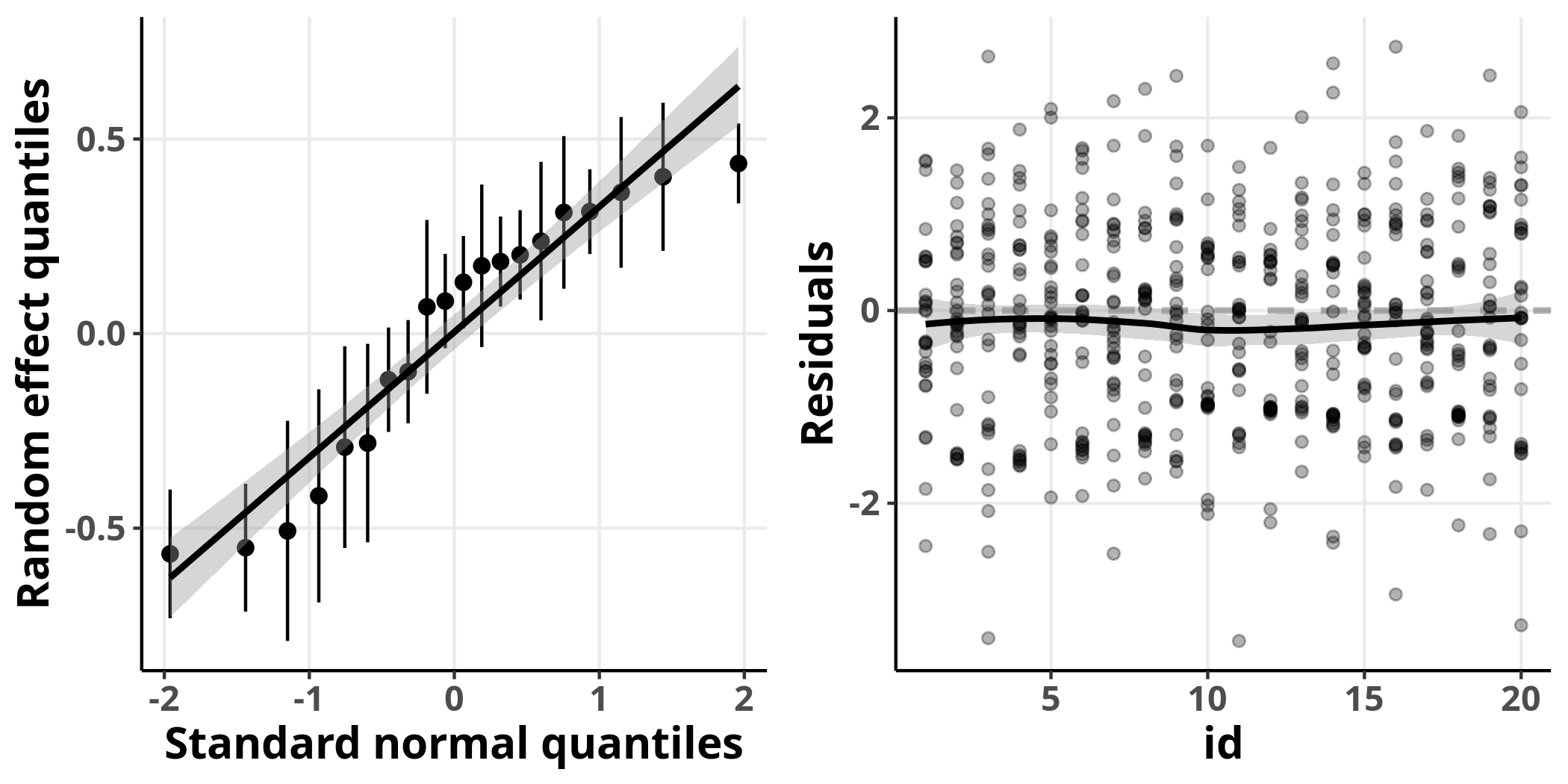
On the left, I plot the expected quantiles of the normal distribution versus the conditional modes of the random effects, which we can think of as the model’s prediction about how much each neuron deviates from the marginal (average) population estimate. We see that they are fairly well fit by a straight line. On the right, I plot the residuals of the individual observations for every neuron. In this plot, the residuals show no detectable structure and are fairly close around the horizontal line $y = 0$. Perfect, we can now move to the evaluation of the simulated residuals for this model.
Expand code
simGLMM = simulateResiduals(glmm, seed = seed, n = nSim, use.u = TRUE)
p7a = PlotQQGLM(simGLMM, my_theme)
p7b = PlotResidualHistogram(simGLMM$scaledResiduals, blank_style)
plot_grid(p7a, p7b)
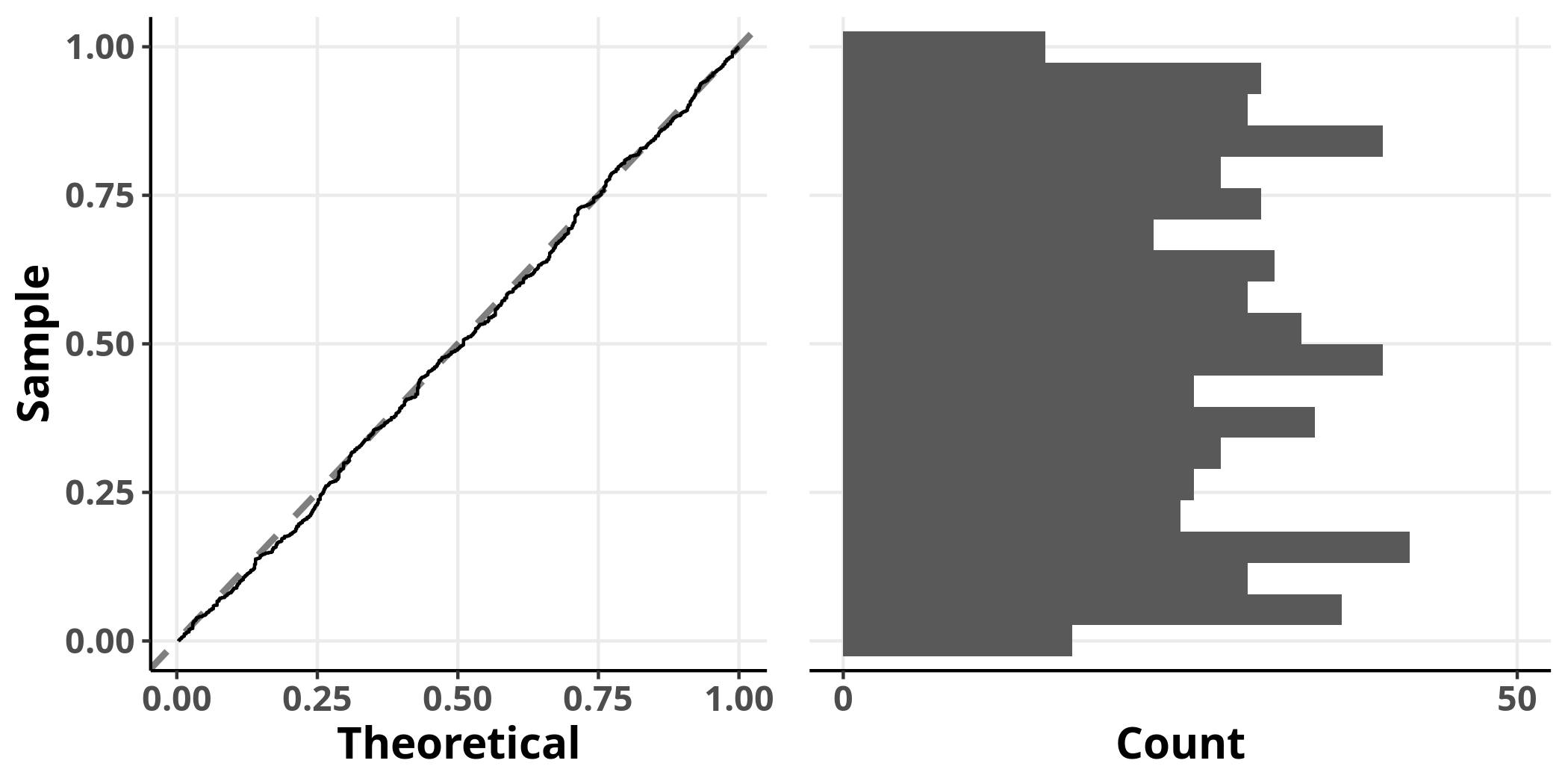
The simulated residuals of this model show no clear deviation from the uniform distribution, suggesting that it adequately addresses the structure of the data. We have finally arrived at our destination!
Summary
- Use a model that respects the structure of your data (appropriate distribution assumptions, random effects)
- Check your model’s output by evaluating diagnostic plots
- Center and/or scale continuous variables on scales with different orders of magnitude from each other
- Use data transformations with care